R
1 + 1 📜 Economics is the best! 📜
R
1 + 1 \[ \frac{\partial u}{\partial t} = \alpha \frac{\partial^2 u}{\partial x^2} \]
The quadratic formula is given by:
\[ x = \frac{-b \pm \sqrt{b^2 - 4ac}}{2a} \]
# Generate sample data
set.seed(42)
x <- seq(1, 10, length.out = 50)
y <- 2 * x + rnorm(50, mean = 0, sd = 2)

# Create plot
plot(x, y,
     main = "Linear Relationship",
     xlab = "X Variable",
     ylab = "Y Variable",
     pch = 19,
     col = "steelblue")

# Add regression line
abline(lm(y ~ x), col = "red", lwd = 2)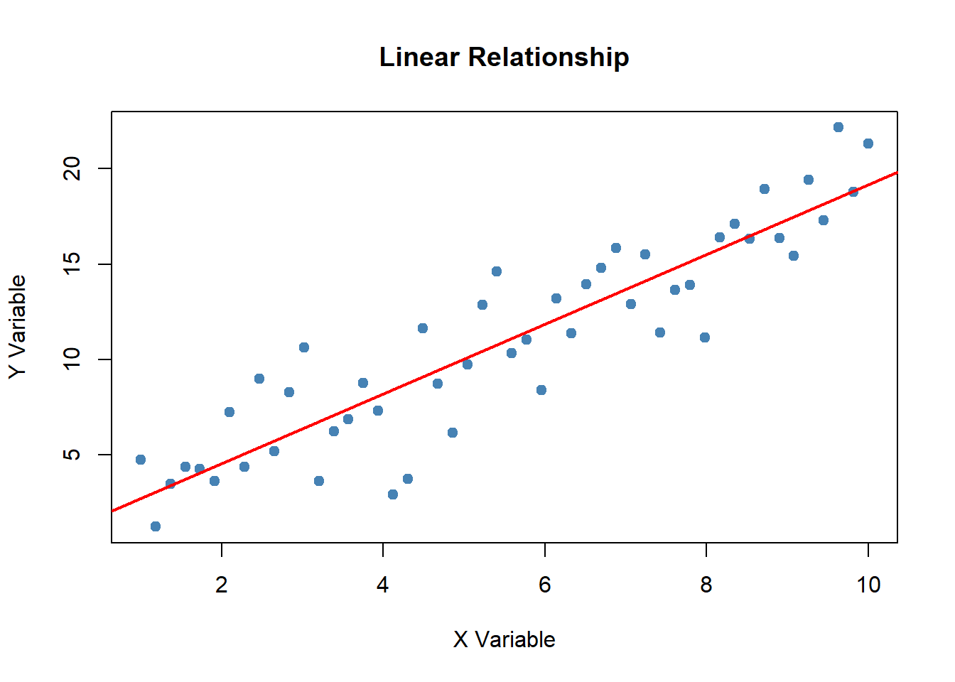
For more complex bits of analysis, hidden annotations are available (the reader can further access notes/assistance by hovering over the circled numbers):
library(psych)
data(bfi)
bfi$jibberish <- rowMeans(bfi[1:10], na.rm=TRUE)
bfi$gobbleyjook <- rowMeans(bfi[11:20], na.rm=TRUE)psych package contains example data that we can access.
bfi dataset that contains personality item responses.
jibberish and gobbleyjook. The $ notation indicates that these scale scores will be appended to the bfi dataframe.
The entire code block can also be hidden unless asked-for. These features permit reviewers/collaborators of different need or curiosity to access source code on an as-needed basis:
library(psych)
data(bfi)
bfi$jibberish <- rowMeans(bfi[1:10], na.rm=TRUE)
bfi$gobbleyjook <- rowMeans(bfi[11:20], na.rm=TRUE)psych package contains example data that we can access.
bfi dataset that contains personality item responses.
jibberish and gobbleyjook. The $ notation indicates that these scale scores will be appended to the bfi dataframe.
Summaries of your analyses are typically the most important (to external review) aspect of your work. These are the illustrations of your story. The primary principles of analyses within a literate programming framework are:
Below you can find a few data presentation enhancements that are enabled via literate programming platforms.
Figure 1.2 demonstrates lightbox capabilities for images embedded within literate programming reports, whereby “clicking” isolates the image for closer inspection. This is useful for images that contain fine detail, user devices that may not display optimally, drawing focus to specific data features, and increasing accessibility for visually impaired viewers.
Figure 1.3 highlights standard interactive components for graphical representations of data. These interactive components are fully accessible within the source document/presentation.
Figure 1.4 is another example of interactivity - a map such as this can help reinforce viewer concepts such as representativeness within normative samples (e.g., where the data “came from” and who the data represents). The audience can get a sense of geographic representation by “zooming out” or “zooming in” and verifying that only North America is represented within this dataset.
Video 1.1 shows another example - videos can be pulled from external sites (like this tutorial on parameterized reporting within Quarto) or can present locally produced video files.
Students can drag points to see how the slope changes:
Adjust the sliders to modify the parabola \(f(x) = ax^2 + b\):
Below is an embedded Observable notebook using the Observable runtime. This imports the runtime and an example notebook module from Observable's API and renders it inline.
If the module import is blocked or unavailable, this iframe provides a simple fallback to view the same notebook directly from Observable.